Redesigning a complicated onboarding and deployment process to ease customer and engineer pain points and allow for business scaling opportunities
SynchroNet CLICK Onboarding
Solution Case Study
Team Project: Complete redesign of the onboarding process
My Role: Sole UX Designer | Lead Researcher
Duration: 6 weeks
Solution
I designed a user workflow through the SynchroNet Portal that reduces complexities and repeated actions with a one-stop place for all of the actions while decreasing the overall forced order of operations for the end-user.
Background
SynchroNet CLICK™ architecture design provided by SynchroNet
SynchroNet CLICK™ is a multifunctional console tool that pairs with Amazon Web Services (AWS) such as WorkSpaces and AppStream providing more robust features and ease of use to manage AWS remote fleets. While CLICK brings more functionality and ease of use, the initial setup is technically complex.
In order for CLICK to function properly, it is necessary to set up links between the customers Active Directory (AD), Security Assertion Markup Language Identity Provider (SAML IdP), and their AWS Cloud environment, and these environments must be tested to make sure everything is linking successfully.
Problematic process
The first step was to understand and evaluate the existing on-boarding process:
Analysis of previous onboarding process
I broke the process down into four main steps and all the sequential steps within, here’s what stood out to me:
The user is required to go to many different locations to complete each step and there were numerous times that required paging back and forth between different places.
The user was directed to use a Word document checklist as a prerequisite before even beginning the deployment process.
The user had to read carefully through pages of documentation in order to complete the deployment process.
The user needed extensive knowledge of AWS infrastructure and technology in order to complete the testing on their own.
My initial assumption: requiring pre-reading, and pre-work to complete this process would be frequently ignored or incomplete by the customer prior to deployment calls.
Interviews
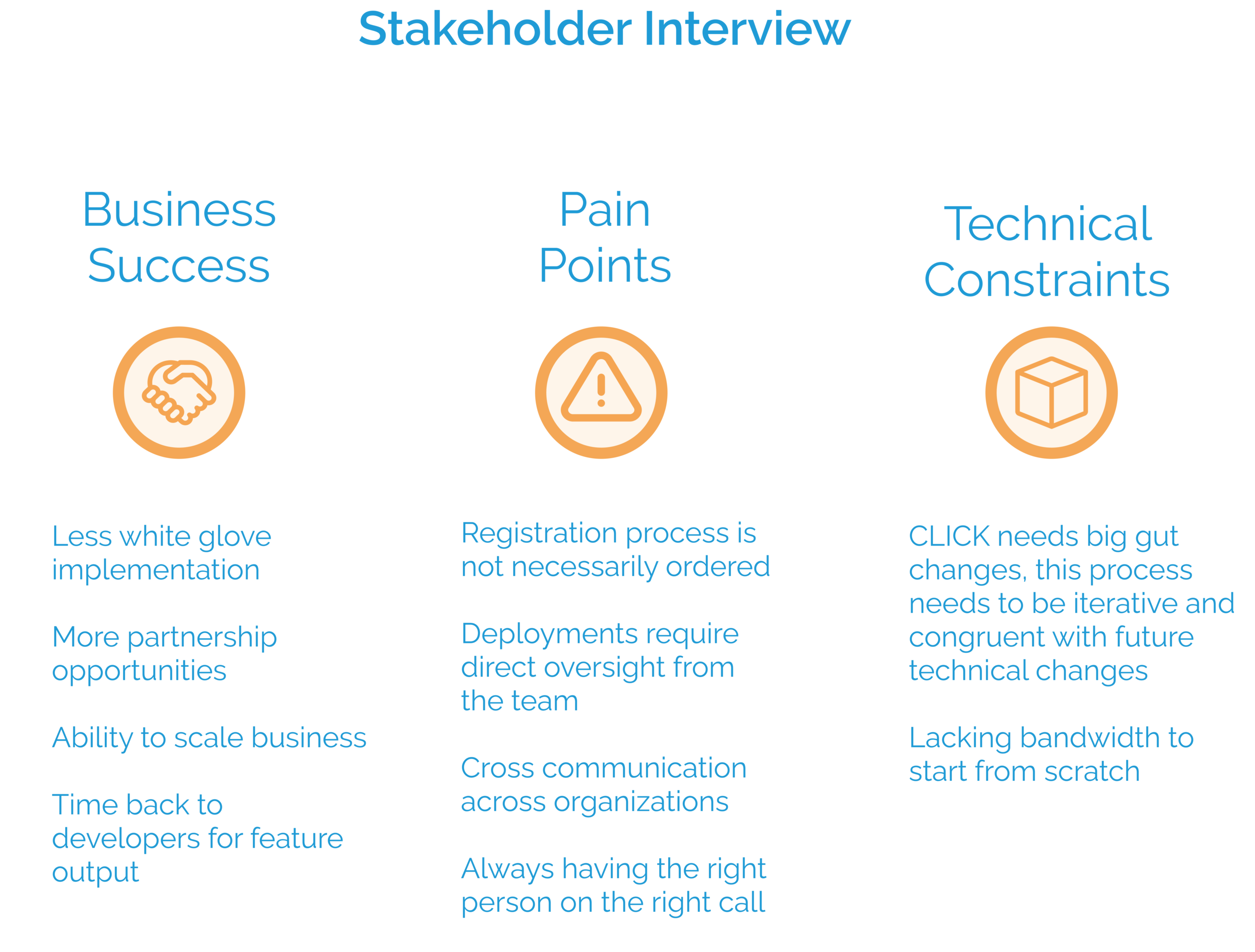
I Interviewed SynchroNet’s 3 stakeholders for this design, the COO, CTO, and Technical Product Manager to better understand the business needs and other perceived problems with CLICK’s onboarding and deployment process. From this interview I found three areas to keep in mind moving forward:
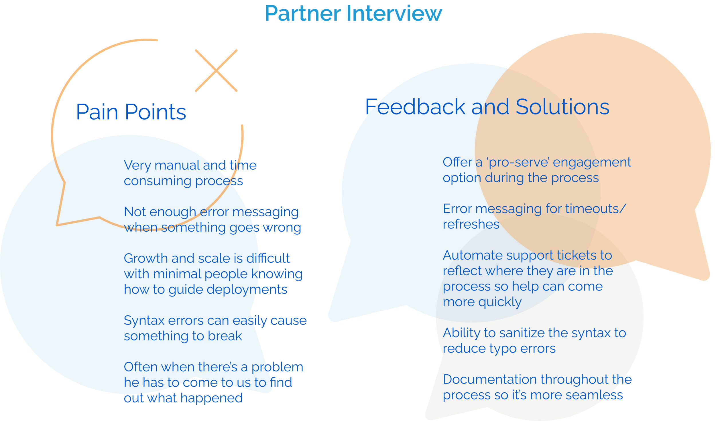
Next, I interviewed a partner, who sells CLICK and guide deployments for his customers. I wanted direct feedback from someone that wasn’t within our organization to see if there is anything we miss due to being so closely tied to our process and product.
following a deployment
The CLICK deployment I followed was the perfect scenario to see the complexities and time spent. Usually, the developers spend 2-3, 1 hour calls with the customer. This customer’s deployment took 6 separate calls to complete.
CLICK deployment customer journey mapping
By mapping the 6 calls from the customer I was able to note when things went well, when there were minor complications, and when the process was halted due to a major issue.
Personas
After speaking to my stakeholders, our partner, and following a customer’s experience it occurred to me that this design solution has three personas. Each of these users have different pain points that often intersect.
Information Architecture
I simplified the steps needed to complete a CLICK deployment
I reduced the number of times the user would have to leave the page to complete a step to four, necessary times (as seen in green).
My design eliminates the checklist pre-work by having documentation and UI fields directly in the onboarding flow.
Now there are only 3 major steps that can be completed at any time during the process. This not only allows for more user control but also lets the customer organization pull in the resources they need without having to schedule multiple calls.
Site map of new portal system
Currently, SynchroNet’s portal is only used for CLICK management and set up, with this design, it can be built upon overtime when new products reach market value.
Designing with Constraints
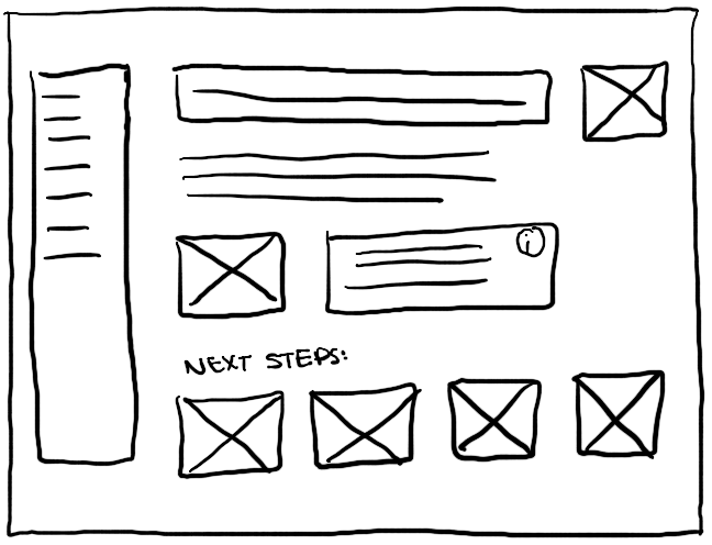
I drafted a few rough sketches initially to show the look and feel.
Examples of first ideations
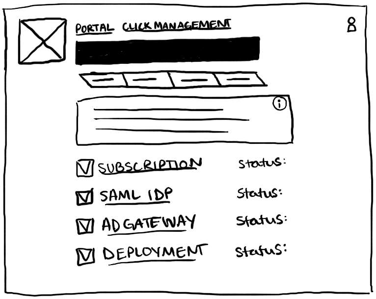
I expanded upon these rough sketches in order to better show the flow of the process and be able to better communicate how the user would interact with them.
User flow sketches
The next crucial part was to design the testing feature UI.
User flow sketches for testing
There are two main components that must be tested to ensure a successful CLICK Deployment, the Active Directory (AD) Gateway and the Security Assertion Markup Language Identity Provider (SAML IdP).
The SAML IdP is crucial in allowing access to CLICK through the organization’s preferred authentication method. (i.e Okta, Azure, AuthO, etc.)
This is one of the portions where the user would have to leave the portal. They would be directed to log in to CLICK, and then redirected when a successful authentication is made. The annotations here are to specify the kind of error messaging and timeout for the requests if no actions are taken.
While the user flow and functionality in these initial sketches were sound, it became clear that the scope for this development cycle would not allow for such a large overhaul of our existing portal. I went back to the drawing board to come up with an intermittent design that would reduce the front-end burden for our developers but still allow for a back-end overhaul of testing.
design solution
I provided a drop-down under Instance for a simple way to show the SAML and AD Gateway portions can be completed simultaneously.
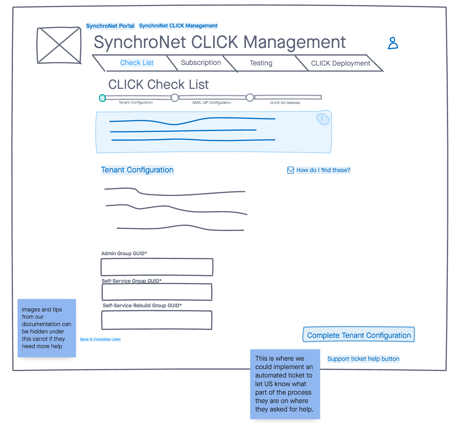
I used symbols and colors to note where the user is in the process, what is complete and what still needs to be done.
I provided a space to inform the user so they would not have to leave this page to see the documentation.
Keeping existing elements made it fast for the developers to revamp the front end, more time to develop the testing features, while still providing more guidance and feedback for the user.
UX copy writing
Directions and copywriting are essential for a complex process.
I provided an intro page to each of the sections allowing the user to see what is entailed before beginning.
I segmented the information so the user would not be overwhelmed by too much information all at once.
Knowing the steps prior to beginning allows the user to see if they have all the information required or if they need to bring in someone else from their organization.
Impact
While this is only the beginning of an iterative process for improving SynchroNet CLICK’s onboarding and deployment process, and it is currently being tested with real customer engagements, here are some things to note so far:
Our partner has since been able to train a new employee on how to do CLICK deployments.
The development team has had time and bandwidth to release a new feature-rich version of CLICK.
Customer deployments have decreased substantially in the number of calls and time it takes.
Error messaging has become a priority throughout SynchroNet CLICK in general, improving the user experience and reducing the number of support calls for small errors.


