Branding and scalable design for a local small business
SuckerPunch Case Study
Freelance Project: Website Redesign | Marketing Design | SEO
My Role: UX/UI Designer
Duration: 1 Week
Problem
SuckerPunch is a small, local, Austin, Tx business specializing in fire cider and needed an attractive, on-brand website redesign to inform, market, and move forward with business success.
Solution
Redesign the current site to be modern, informative, and true to the brand while allowing for future scalability and growth.
Debrief
Fire cider fermenting, image edited by me
My client wanted a clean informative website that spoke to the true nature of their product, which contains all local organic ingredients. It was made clear from be beginning that they were not pleased with their current site, and felt it was not truthful to the brand. They simply wanted to inform and educate the user in an interactive way that was not pushy, giving the user a sense of control in the way they chose to digest the information and proceed.
They did want to increase traffic and allow for contact to order the product, but being that they are a very small company and do everything in small batches currently, they did not want to create a full E-commerce site. The goal in creating the site all together is to further their plans and business goals to eventually partake in local farmer’s markets and have a site reflecting their values. They recognized the importance of having a site for credibility in today’s age, but having a clunky site gives less credibility than having no site at all.
Updating the site heading and navigation
My redesign of the banner and navigation bar interaction
Original site banner and navigation bar
The original site was a clash of vibrating color and blurry product images. The old sharp boxed in look was eliminated to create a more clean and modern banner.
I also changed the verbiage for the navigation in order to create continuity with the brand. SuckerPunch has a slight cheeky tone, that is meant to be in your face as the name suggests.
Correcting product images on the site
Redesign of the product image
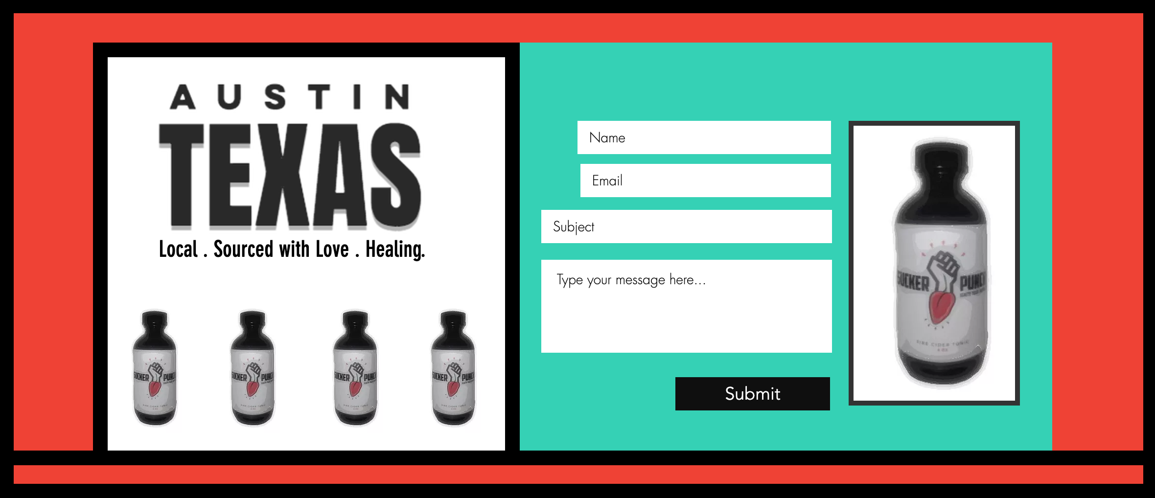
Previous contact form displaying blurry, pixelated product images
A major improvement I made to the site was designing clear product images to display how their product actually looked.
Typography for cohesion, delight, and clarity
“Nature yourself with this unique remedy blended with precision for a SuckerPunch path to wellness” does not flow naturally.
Adjusting type sizing, weight, tracking, and color I was able to deliver a bright and fun way to display the message while providing a more natural flow and clarity.
Previously I counted 8 different fonts on the site, In my redesign, I kept the font consistent using a clean san-serif and using different sizes and weights to bring attention to important information and allowing information to be easy to take in.
Example of site typography
Interaction Design
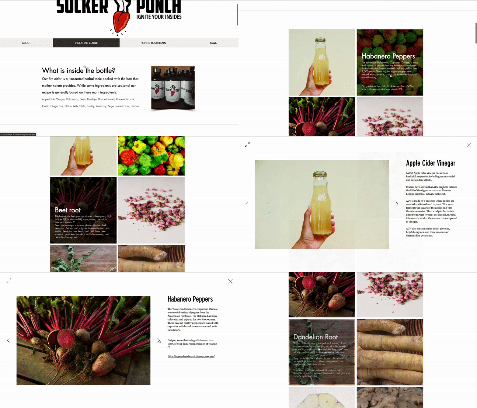
In order to make a large amount of information digestible, I made the ingredients list into an interactive list for the user to go through.
This I also edited and wrote a large portion of the copy for the ingredients list making it to up to date with the product.
The list includes a hover feature that gives the benefits of each ingredient. When clicked a light box opens with the full information allowing the user to access an easy and interactive way to read the information.
Responsive Design
Mobile About screen
Mobile ‘What’s in the Bottle’ screen
Simplifying the site for mobile
Simplifying information and allowing it to stack for easy scrolling
Using a hamburger menu, with a side overlay, to move through the site pages giving the user a familiar way to navigate
A ‘Load More’ button for the ingredients list to not overwhelm the user with an endless scroll through the screen


